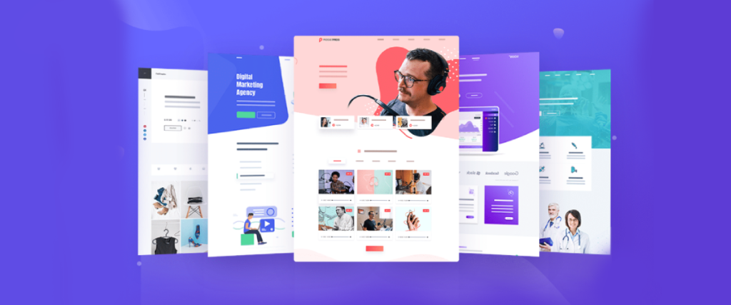
When designing your first website, one common mistake is overwhelming visitors with too much information or a cluttered layout. It can be tempting to showcase everything you have to offer right away, but this often leads to confusion and frustration for your audience. Instead, focus on clarity and simplicity. A clean design with plenty of white space can help guide visitors smoothly through your content.
Prioritize your most important messages and elements, such as your brand identity and call-to-action buttons. Ensure that your navigation is intuitive, allowing users to easily find what they’re looking for without unnecessary clicks. This not only enhances user experience but also increases the likelihood of conversions, whether that means signing up for a newsletter, making a purchase, or any other desired action. Remember, a well-organized website that communicates your message effectively can significantly impact how visitors perceive your brand.
Another frequent error is neglecting mobile responsiveness. With the increasing use of smartphones and tablets, it’s vital that your website looks and works just as well on smaller screens as it does on desktop computers. Failing to optimize your site for mobile can alienate a significant portion of your audience and lead to higher bounce rates. Test your design on various devices to ensure that text is readable, buttons are tappable, and images scale appropriately.
Furthermore, responsive design not only improves user experience but also helps with search engine optimization. Search engines prioritize mobile-friendly sites in their rankings, meaning a mobile-optimized site can boost your visibility. Therefore, investing time in creating a responsive design can pay off in enhanced user engagement and satisfaction, ultimately leading to better results for your site, whether in terms of traffic, lead generation, or sales.
A third mistake is overlooking the importance of choosing the right color scheme and typography. These elements do more than just make your site look pretty; they play a significant role in reflecting your brand identity and making your content readable. Using too many contrasting colors can be visually jarring, driving visitors away instead of attracting them. Stick to a cohesive color palette that aligns with your brand values and evokes the right emotions.
Similarly, selecting the appropriate fonts is crucial for enhancing readability and ensuring that users can quickly consume your content. Avoid using overly complex or decorative fonts that may be hard to read, especially on smaller screens. Instead, opt for clear, simple typography that complements your design. The combination of a thoughtful color scheme and appropriate typography not only improves aesthetics but also reinforces your branding, creating a memorable experience that leaves a positive impression on your visitors.
Failing to consider load times is another critical misstep that can severely impact user experience. Users today expect websites to load quickly, and studies show that even a one-second delay can lead to increased bounce rates. To avoid this, optimize your images to ensure they are not unnecessarily large, and consider using tools that minimize the loading time of scripts and stylesheets.
Moreover, utilizing a reliable web hosting service can significantly affect your website’s performance; choose one that offers strong uptime guarantees and efficient server speed. It’s also a good idea to regularly test your site’s speed and make adjustments as necessary. Search engines like Google take load times into account when ranking sites, so improving this aspect can also enhance your chances of appearing higher in search results. Ultimately, prioritizing quick load times helps keep visitors engaged, encouraging them to explore your content rather than clicking away in frustration.
Lastly, one major pitfall to avoid is not incorporating clear calls to action (CTAs) throughout your site. CTAs guide your visitors on what to do next, whether it’s signing up for a newsletter, downloading a resource, or making a purchase. Without these prompts, users may leave your site without taking any meaningful action, resulting in missed opportunities. Make sure your CTAs stand out visually by using contrasting colors or buttons that draw attention.
Place them strategically throughout your pages, ensuring they appear at key moments in your content. For instance, a well-positioned CTA after valuable content can encourage users to engage further. Also, use action-oriented language that conveys urgency or value, like “Join Now” or “Get Your Free Guide.” Testing different placements and phrases for your CTAs can help you determine what resonates most with your audience. By effectively implementing clear calls to action, you can guide your visitors toward their next steps, ultimately driving better engagement and conversion rates.

